
GUARDIAN
Client ● Graphic Design ● Digital (Conceptualisation and Adaptations) ● Print (Point of Sale Materials)
Type of Project
Tools used
Client (Agency)
Illustrator, Photoshop, Indesign, After Effects
Graphics for Digital Adaptions (Social Media, E-commerce), Point of Sale Materials, Catalogues
Deliverables
ORANGE PARTY
As part of an agency team for Guardian Singapore, I was responsible for designing the Orange Party promotional catalogue, a key bi-monthly sales campaign. My work included creating the visual layout for the catalogues, adapting designs across various formats and sizes while ensuring consistency with Guardian’s brand identity. This involved fast turnarounds, close attention to detail, and collaboration to meet marketing objectives.

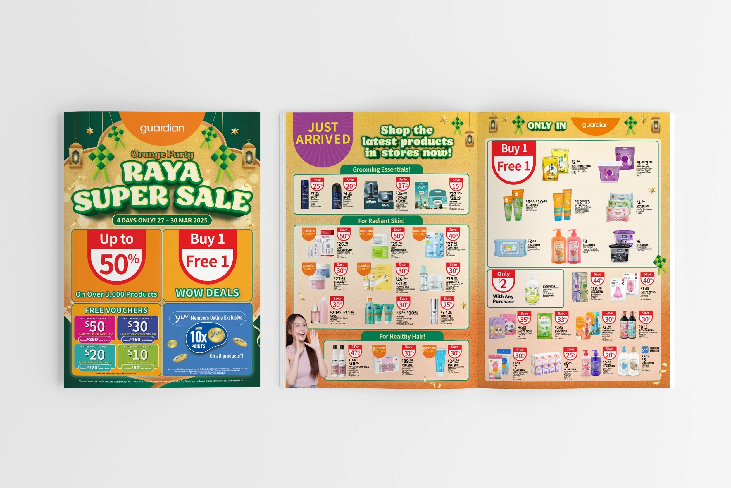

The works shown here include both proposed and final cover designs, along with adaptations across digital and print formats. Examples include point-of-sale materials such as hanging mobiles and standee headers, as well as digital assets like social media visuals and
e-commerce banners.

PROMOTIONAL / EVENT CAMPAIGNS


These campaigns were created for promotional and event-based launches, with adaptations made for both social media and e-commerce platforms. For in-store visibility, the designs were also applied to point-of-sale materials such as hanging mobiles and standee headers, ensuring consistency across digital and physical touchpoints.
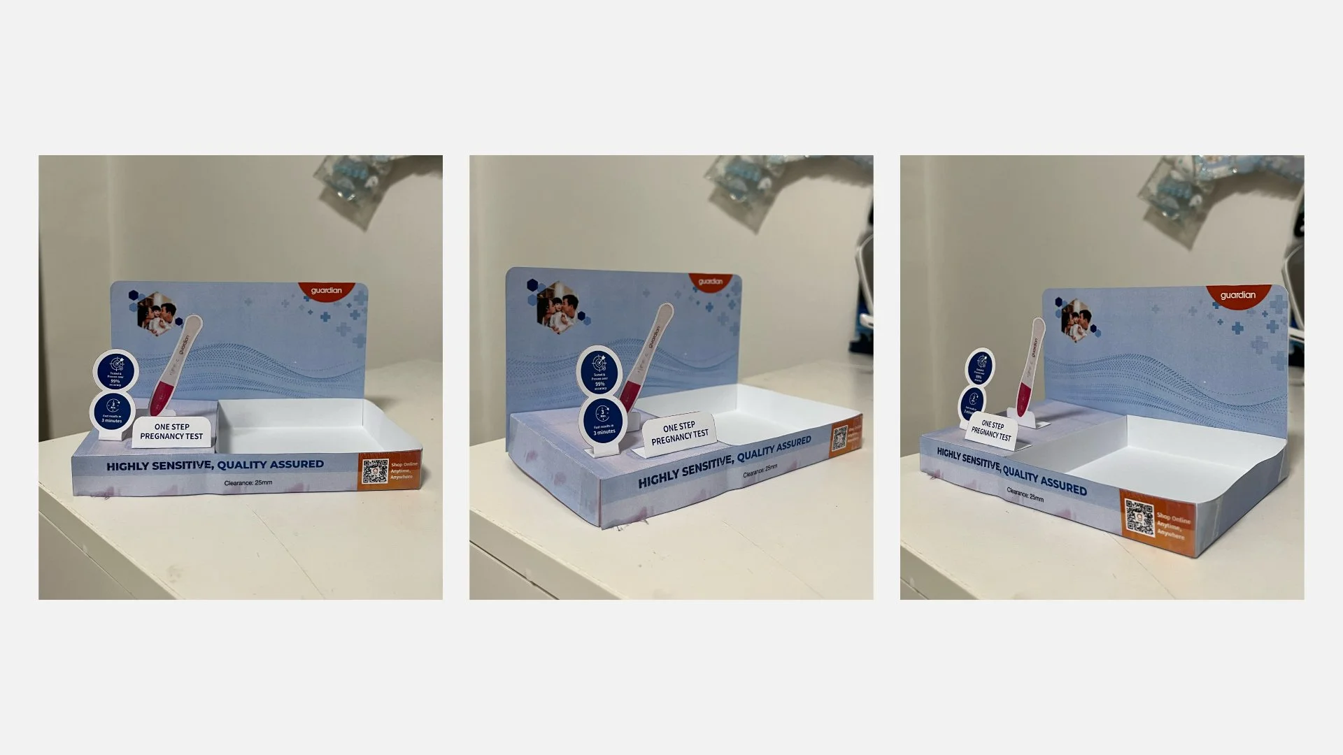
TOP SHELF DESIGN

I was tasked to create a top shelf display for Guardian’s pregnancy test kits. I conducted visual market research through in-store observations and online research to inform my design. I started with sketching out on paper then creating the design in illustrator and doing a mockup in photoshop before test printing a small scale of the design in paper.
In-store implementation
The final design brought to life on-shelf, following rounds of iteration, mockups, and test printing!
Previous iterations

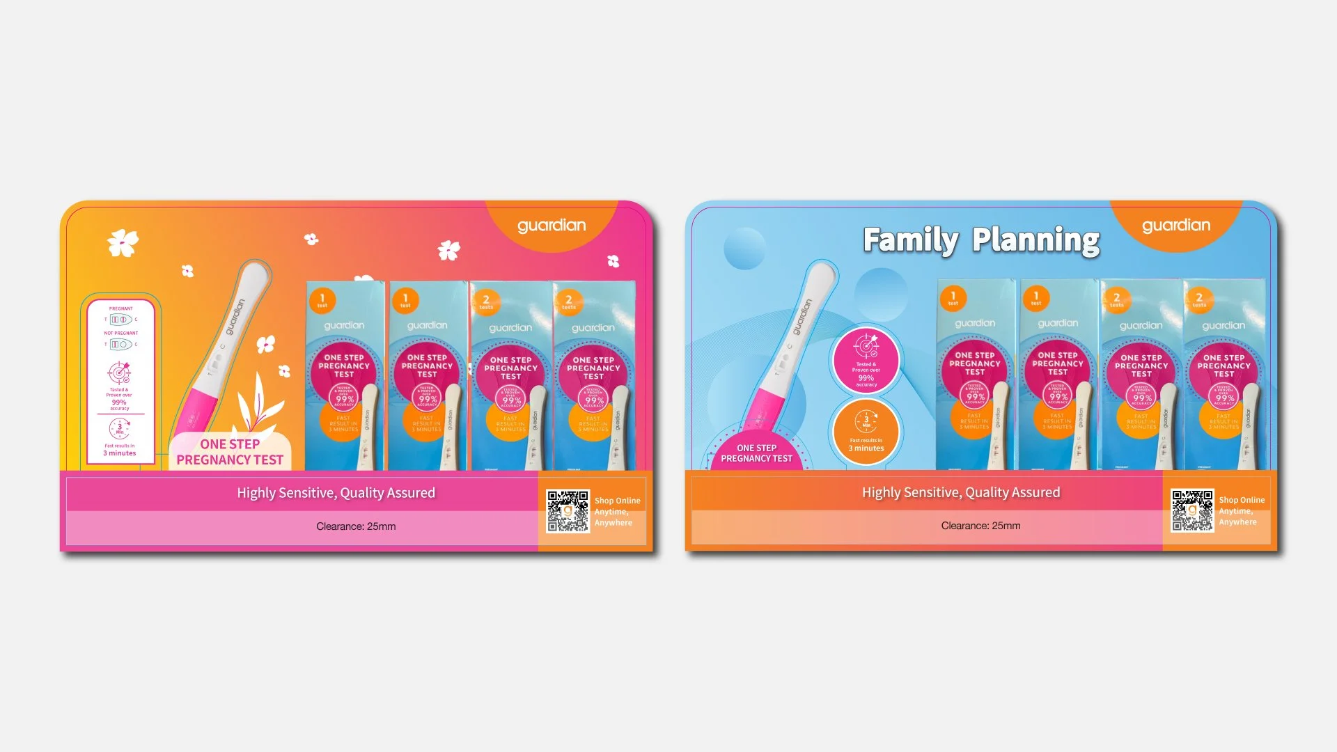
These were my first two iterations before arriving at the final design. The first explored a softer approach while still incorporating orange as a key colour. The second took inspiration from the actual product packaging to create a more seamless look. Elements from both versions, particularly the pop-up ideas, were combined and refined in the final iteration.